A Composition of Writing Systems within Pattern
BA(Hons) Graphic Communication: Final Project
Introduction
My field of study for my Final Major Project is looking at written language, both present and extinct. When I look the written language, I see letter as shapes placed together as formation to create a pattern, which placed in the right order creates words. It is the human mind that makes us connect a certain form of shape as a letter and grouping of shapes as a word. I want to take away the human connection to the letter forms, leaving a collective of pure shapes.
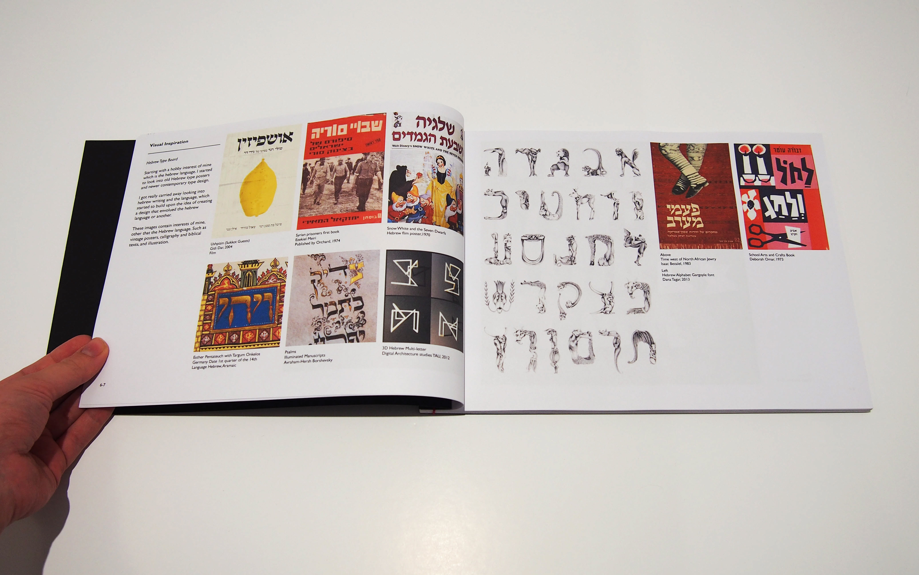
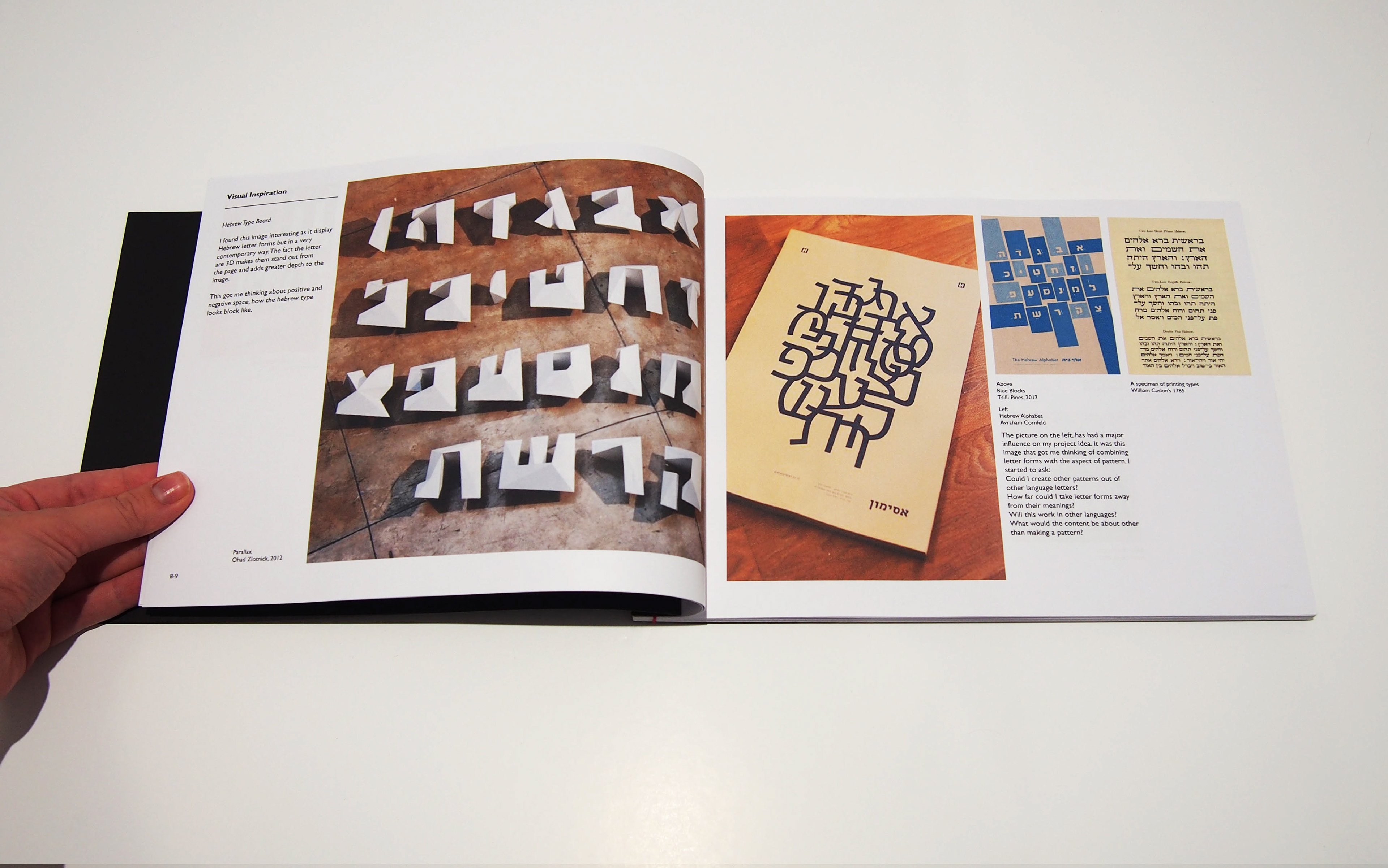
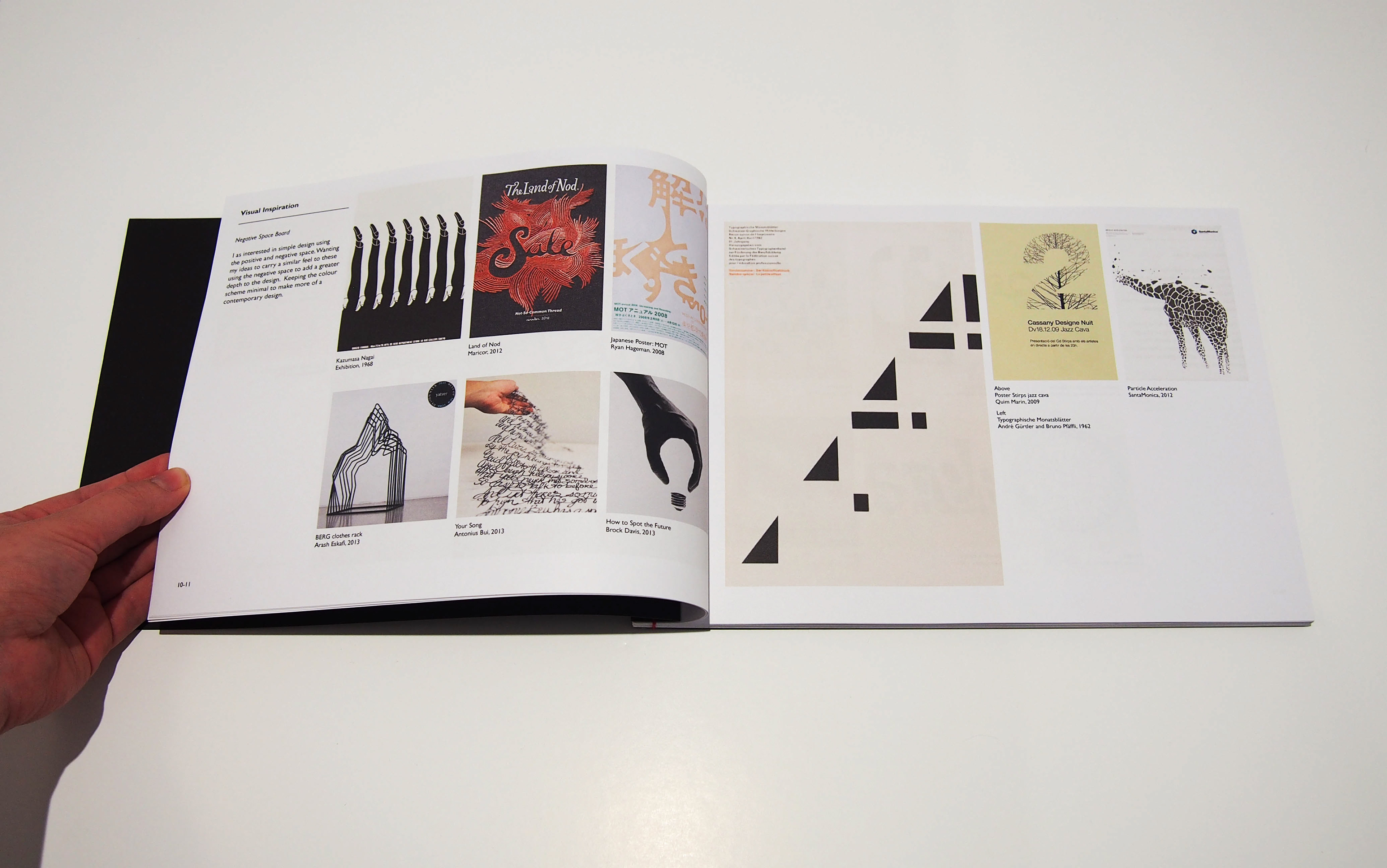
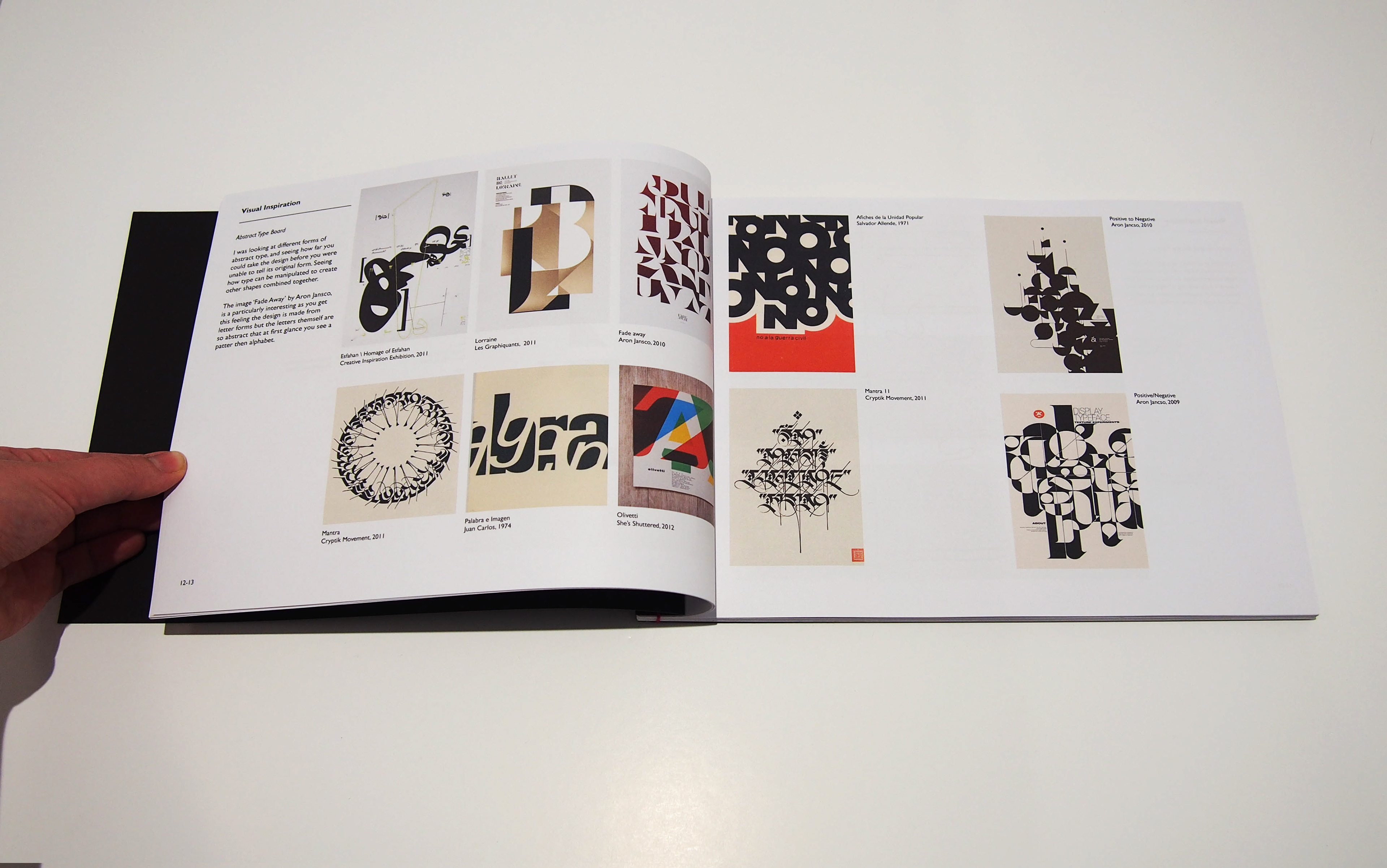
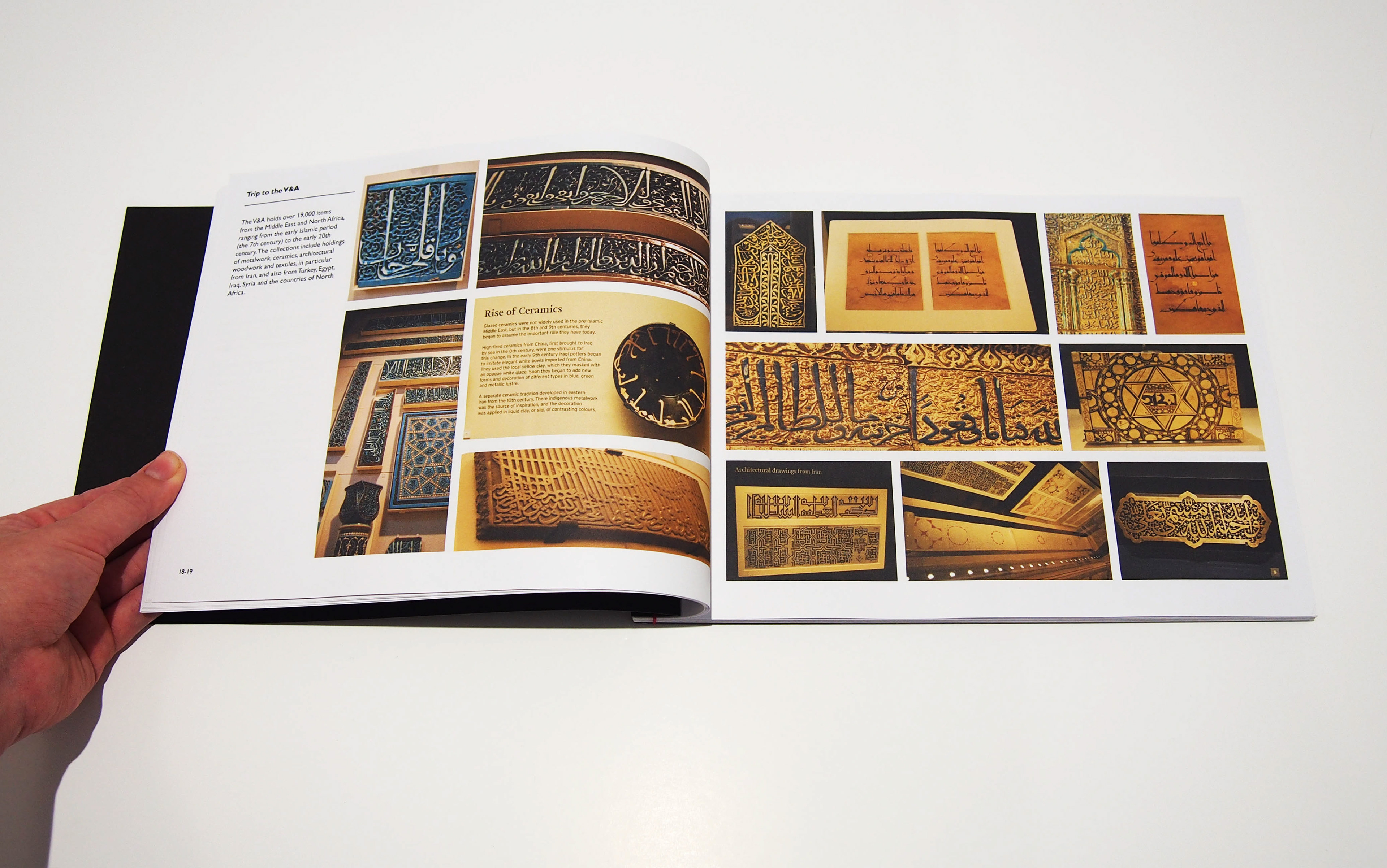
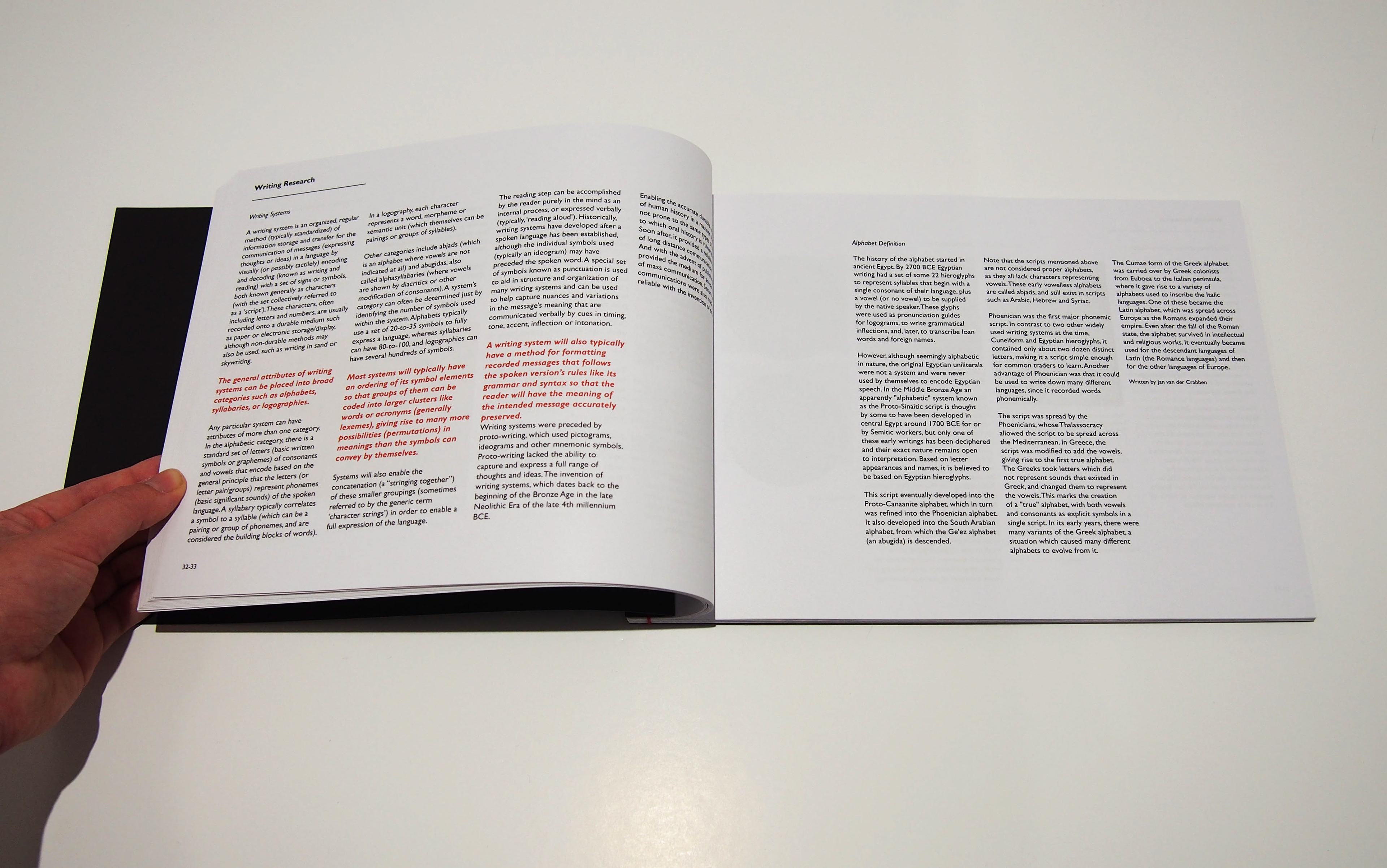
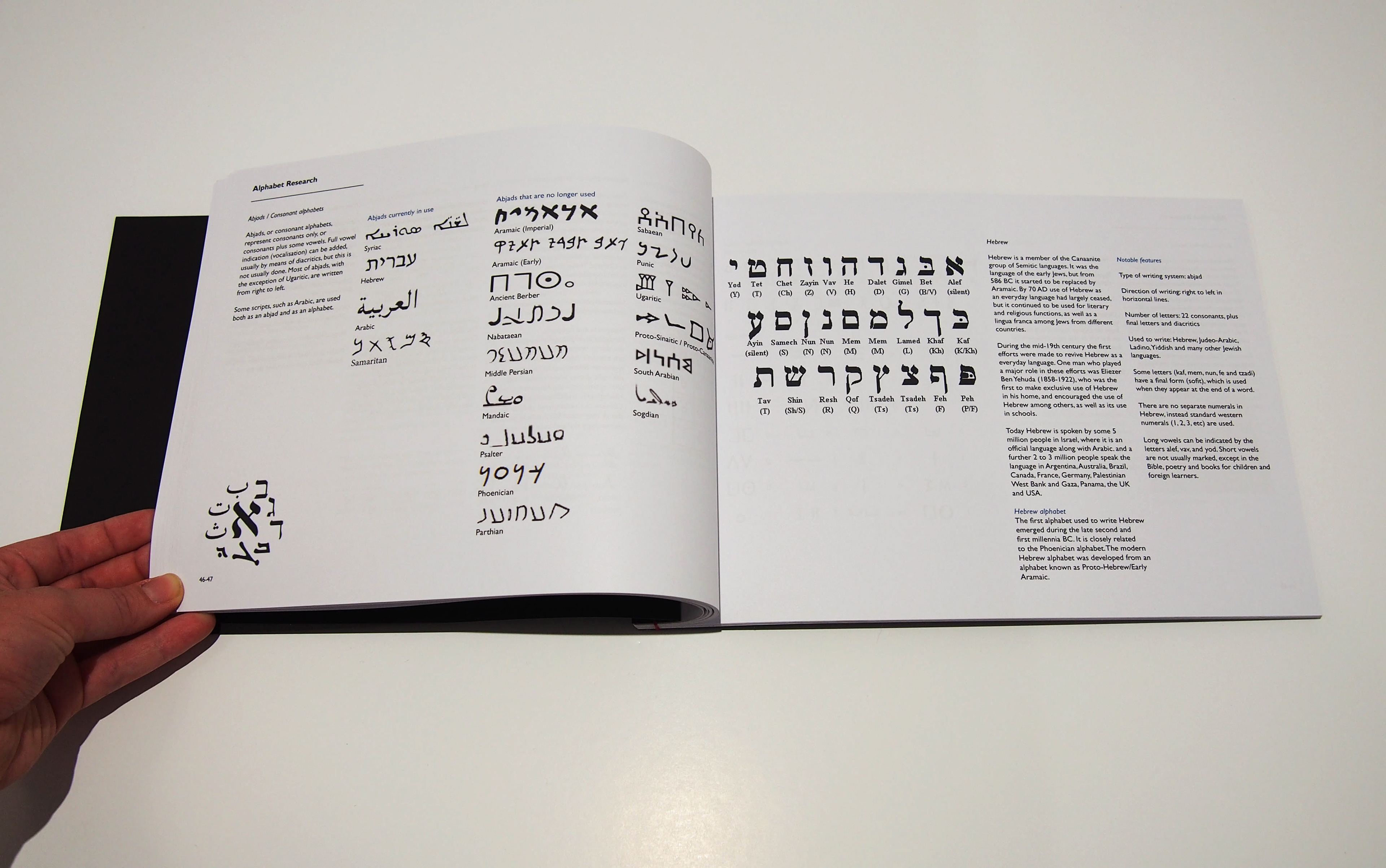
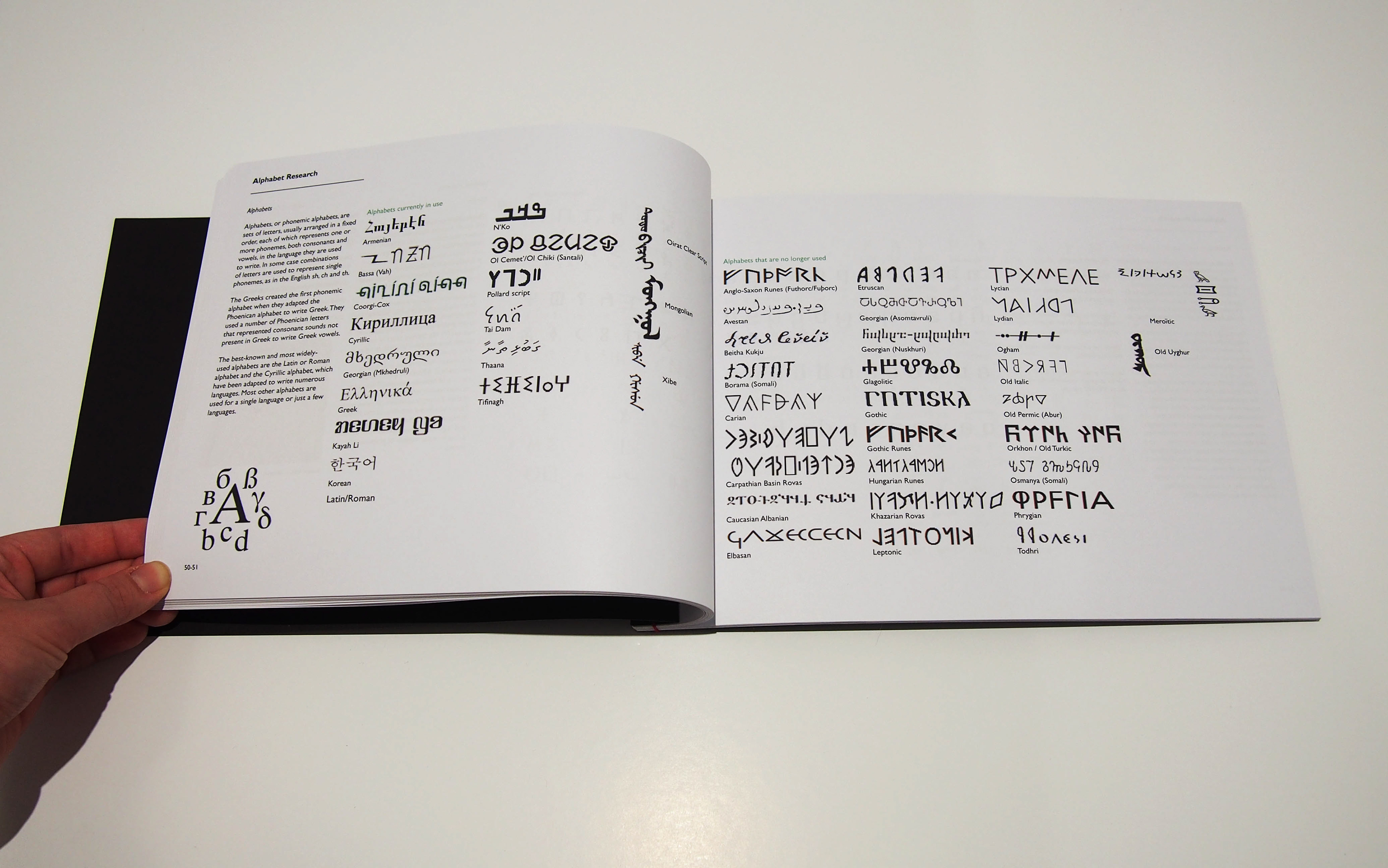
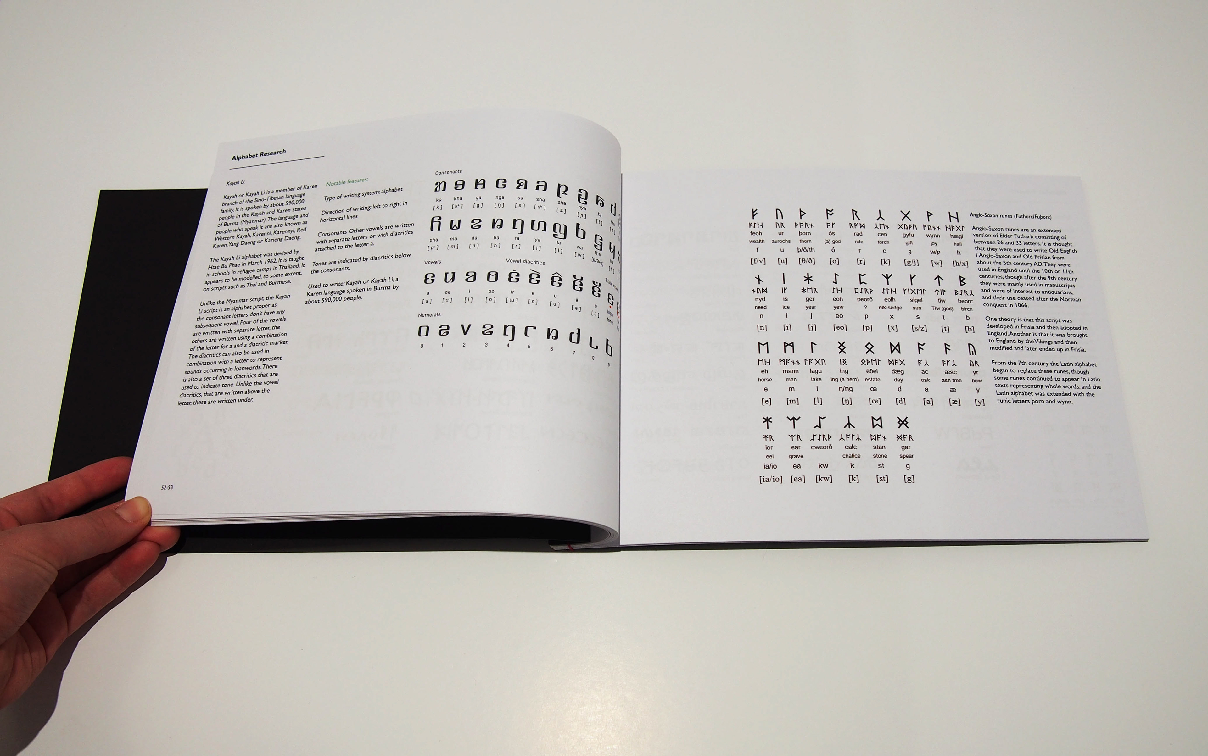
My original inspiration for this project was due to a visit to the V&A in London. It was there, I saw craved stone windows that are designed with repeating geometrical pattern in the South Asia gallery. I started to think about I could do to combined pattern with type forms. My research started with exploring into at spoken language, at the beginning in focused on one language which was Hebrew, thinking what I could design or how far I could take it. Researching into different spoken languages, I started to realise, my research was going into the wrong direction and that it was the written word I needed to research into, not the spoken. I started to look separately at typography and pattern, then at the combination of the two, this lead me to looking at Asemic Writing. Initial ideas for my project outcome, were to combine a variety of different writing systems with a form of pattern design. I was interested in creating abstract formations of pattern using the letters forms from a various writing systems. I want to see how far I can push the boundaries of typography, and to see if I can create a composition, which has a design that at first is a piece of attractive artwork, but then you realised the piece is created from letter forms and not abstract shapes.
Personally, I found this a challenge, as the subject of typography has been a difficulty of mine since I started Graphic Communication. During my past my projects, I’ve always tried to stay away from the subject of typography, as I find the subject a mine field of choice, with easily choosing the wrong path, leading to an unsatisfactory result. With this project, I wanted to contour my fear of typography and create something that would be unique in the form of abstract typography.
If I had more time I would of created an exhibition design layout to show how the pieces could look like within a museum or gallery. Along with exhibition plan boards, I would design my Critical Reflection into a publication, which people would be able to read into how I came to the art work I created. Ideal this would be in a magazine size and format. I would have also been interested in how the patterns would have worked in a fabric screen printed design on silk or printed on the fabric printer, to create scarfs and other home ware. I would like to display the discs as 3D objects with in the degree show, making them slowly spin with a bright LED light(s) focused on the circle to cast a shadow. This would be a creating a constantly abstract pattern formation, giving the design another level of depth.
Conclusion
By using various written languages, I noticed my project could connect to a wide variety of cultures and audiences and not just the creative audience. I wanted my designs to be open to everyone, they can be viewed as aesthetically pleasing pieces of art and/or be seen as designed type communicating a language. As this projects deadline approaches, I plan to continue creating more compositions of the letter forms within pattern, ideally I would like to apply these designs into the ‘real world’. With a plan to go into Print design after I graduate, I would look at how I can apply these designs to clothing and home ware. The Anglo-Saxon Rune is a particular design I am wanting to take further. Overall the whole course of my degree, I felt that I never properly fitted into the course, coming from a background in illustration. It was only when I got into this final major project I found that, I really come into my own, finding a place within Graphic Communication course where I fit in.
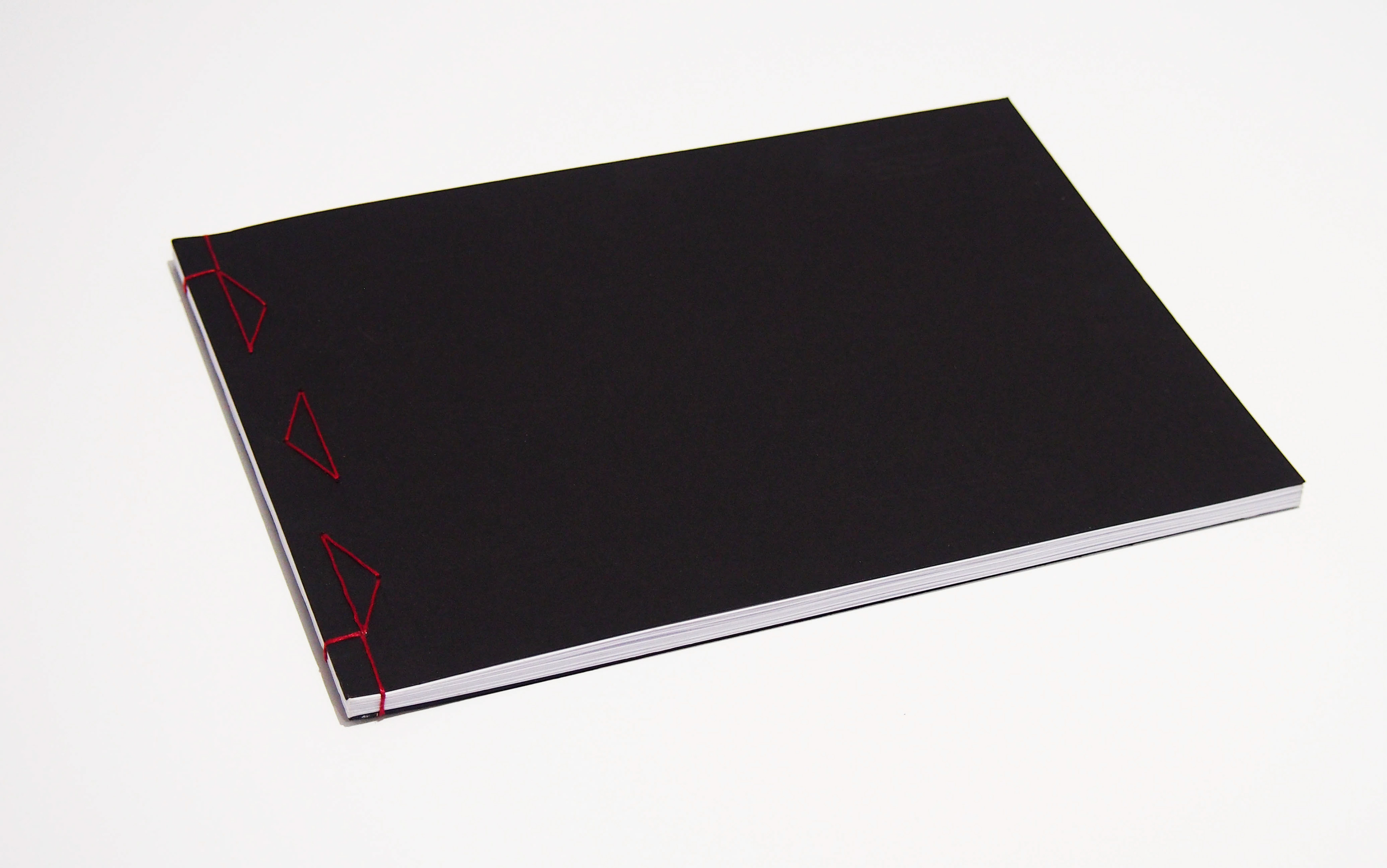
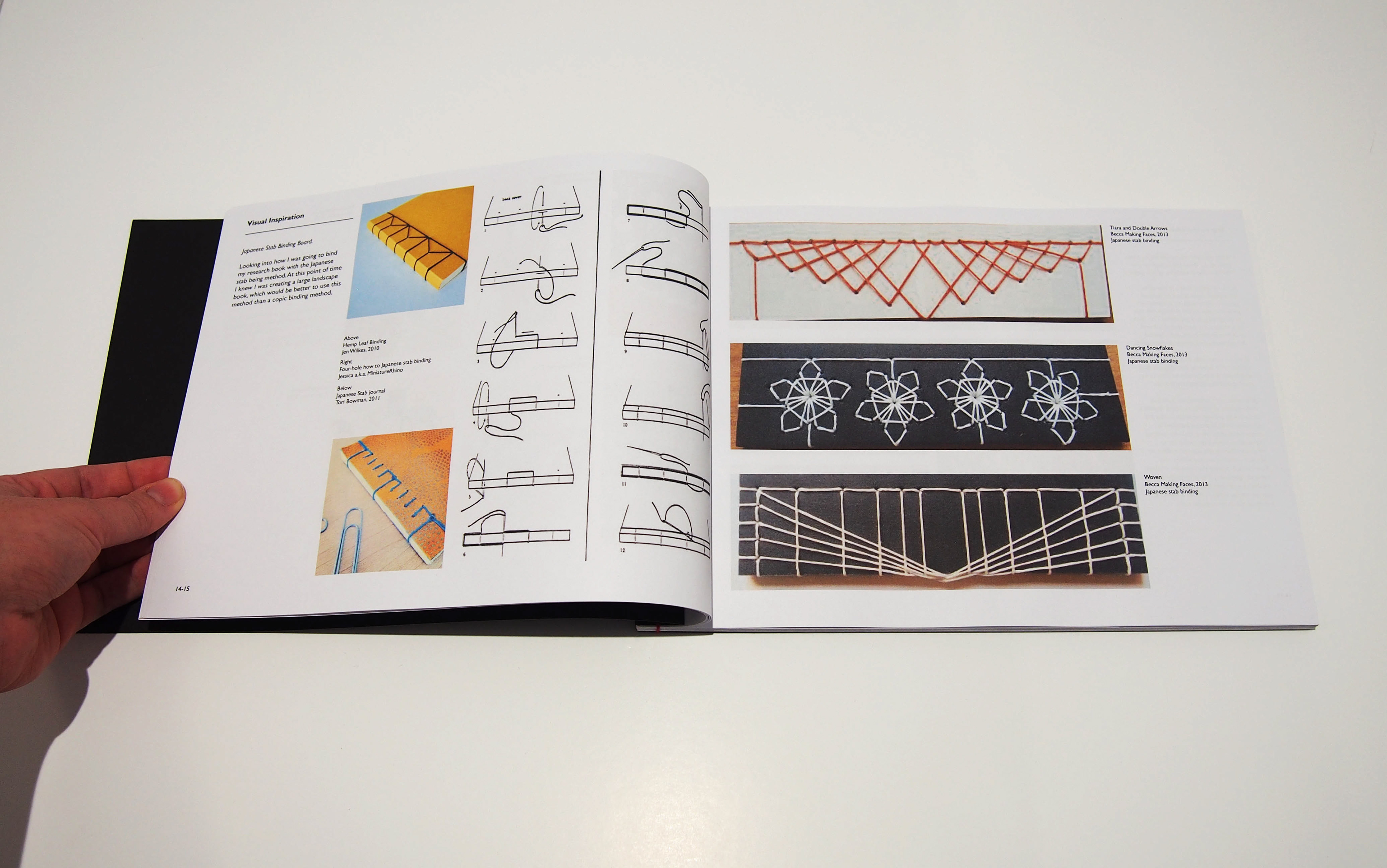
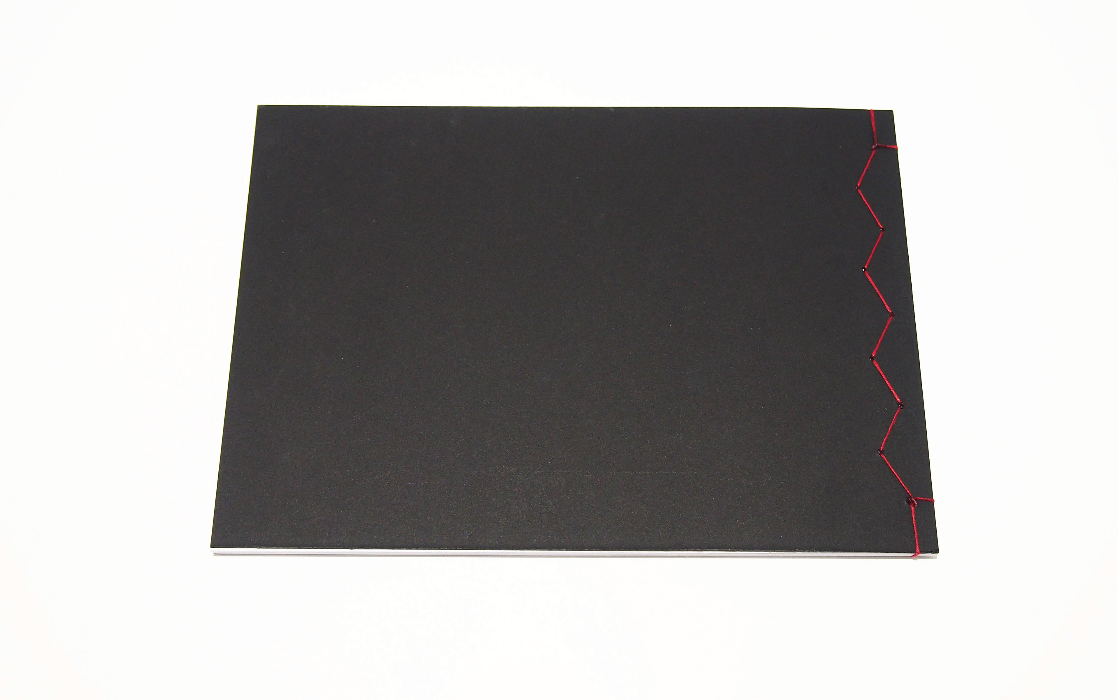
Japanese Book Binding
I created a book binding stitch pattern that was simple but held the book together strongly.
Laser Etching
The process book title was laser etched at the top right hand corner of the book. This is difficult to see from the photography but when held in person, the effect adds a nice touch to the front, keeping it simple in design.